UX Design project aimed at improving the CPA exam preparation experience through a user-centric web application. The project focused on enhancing study flow with a full UI redesign supported by user research, persona development, and prototyping, ultimately delivering a platform that increased retention and engagement.
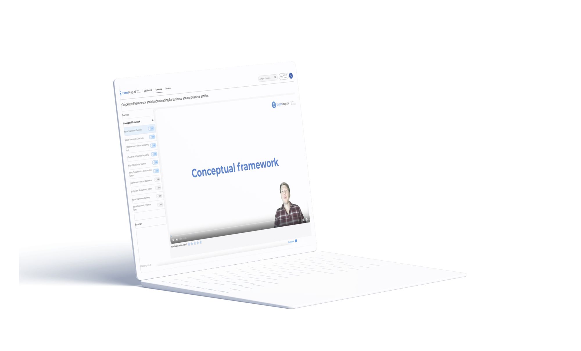
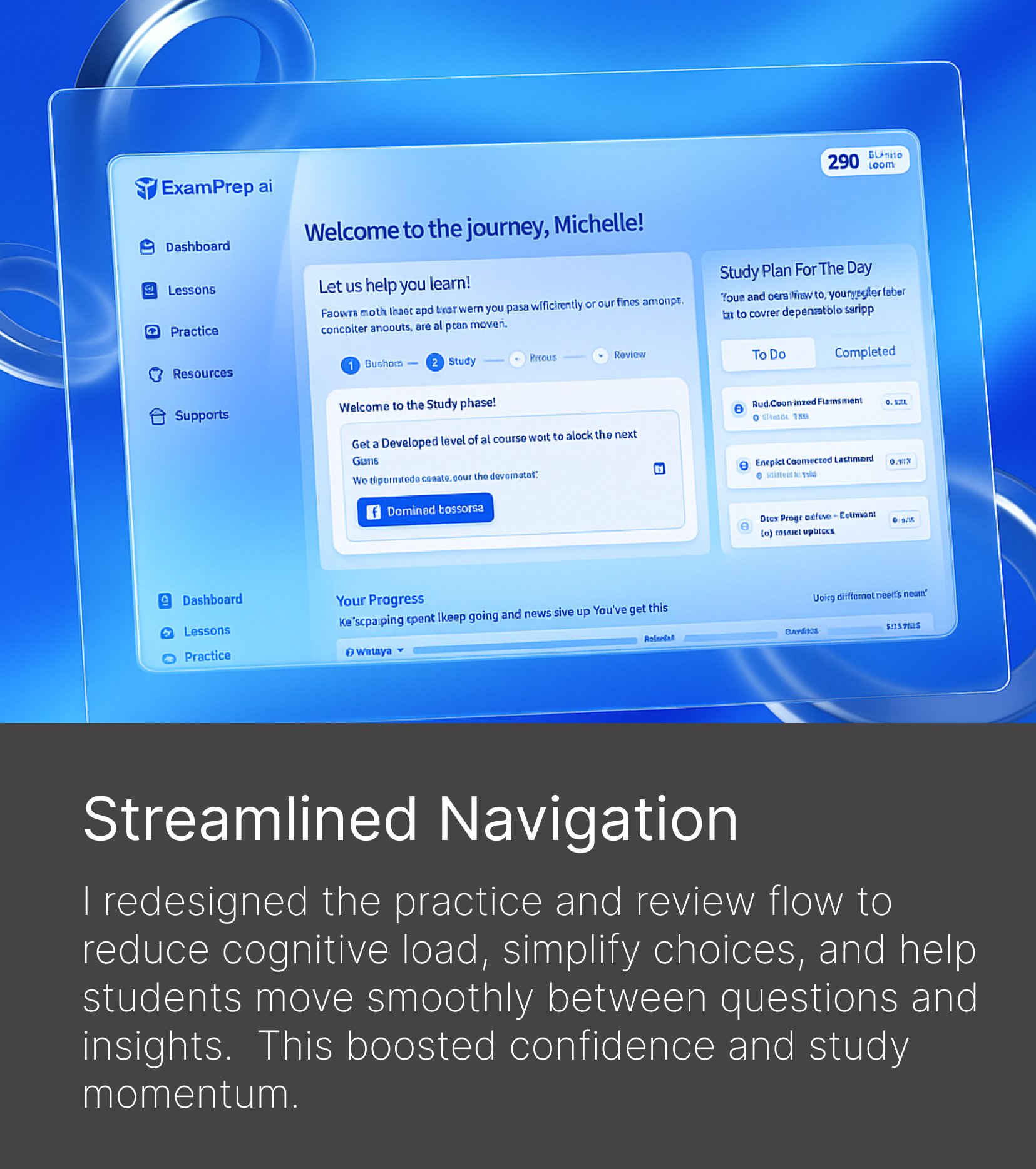
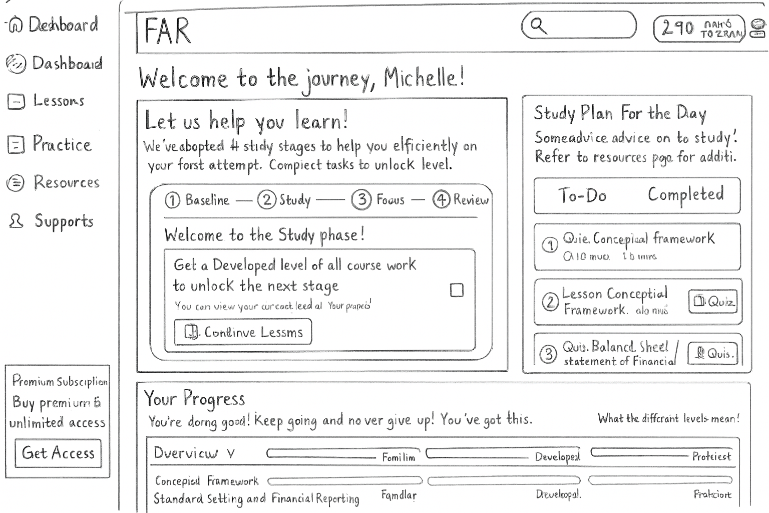
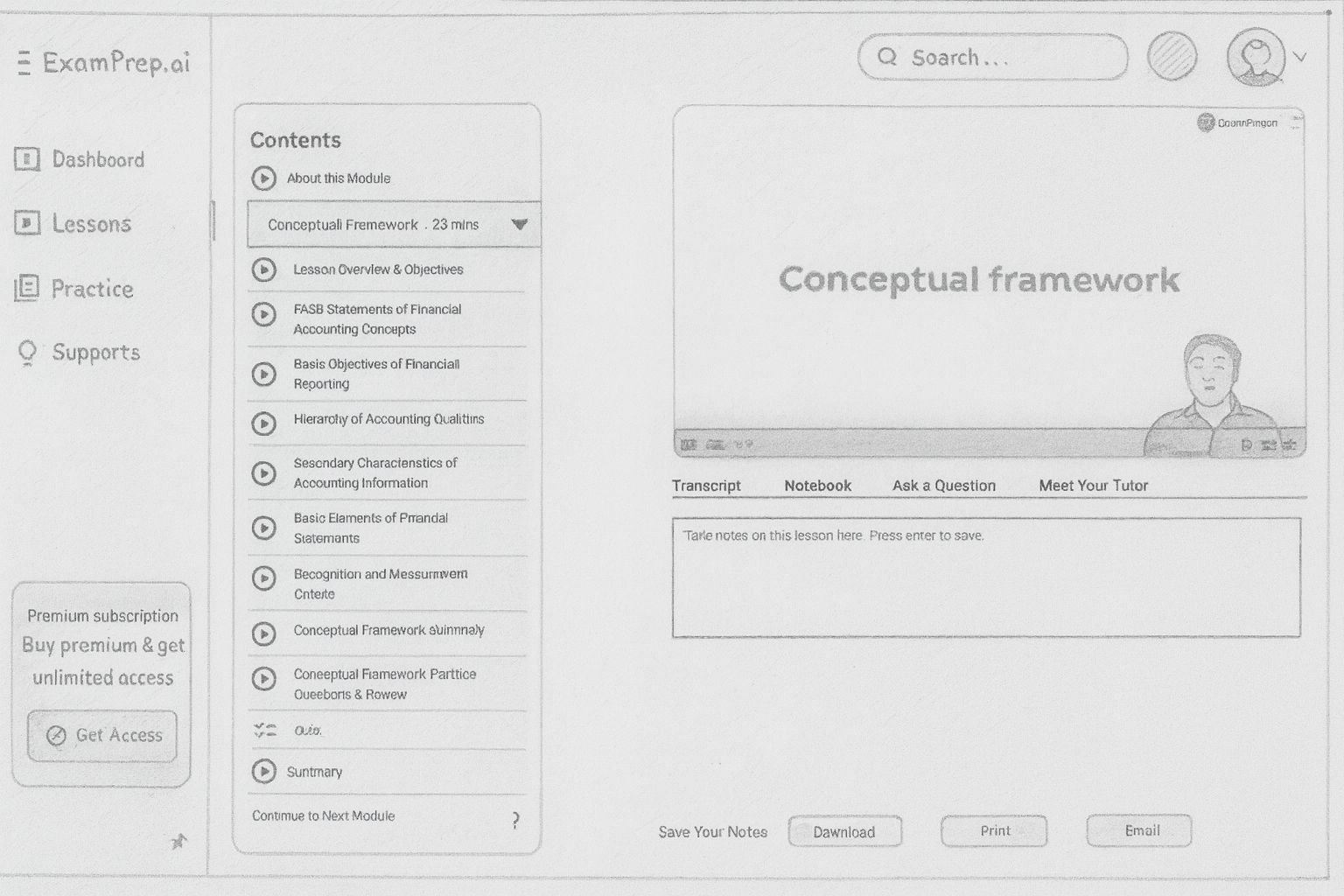
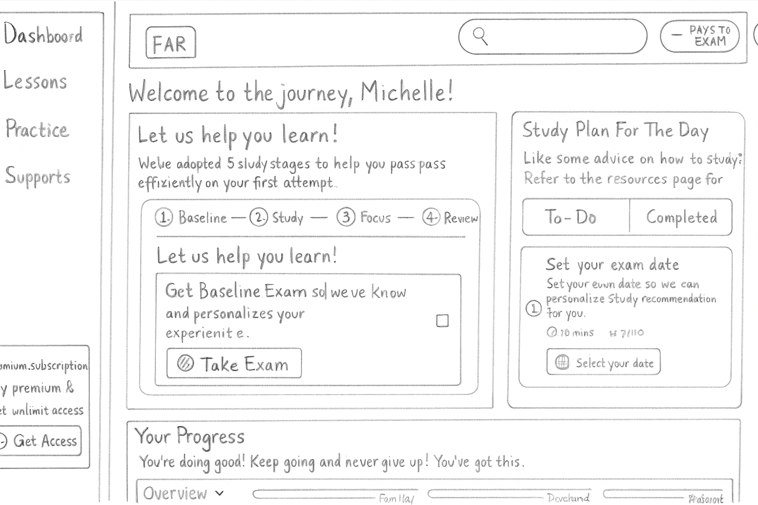
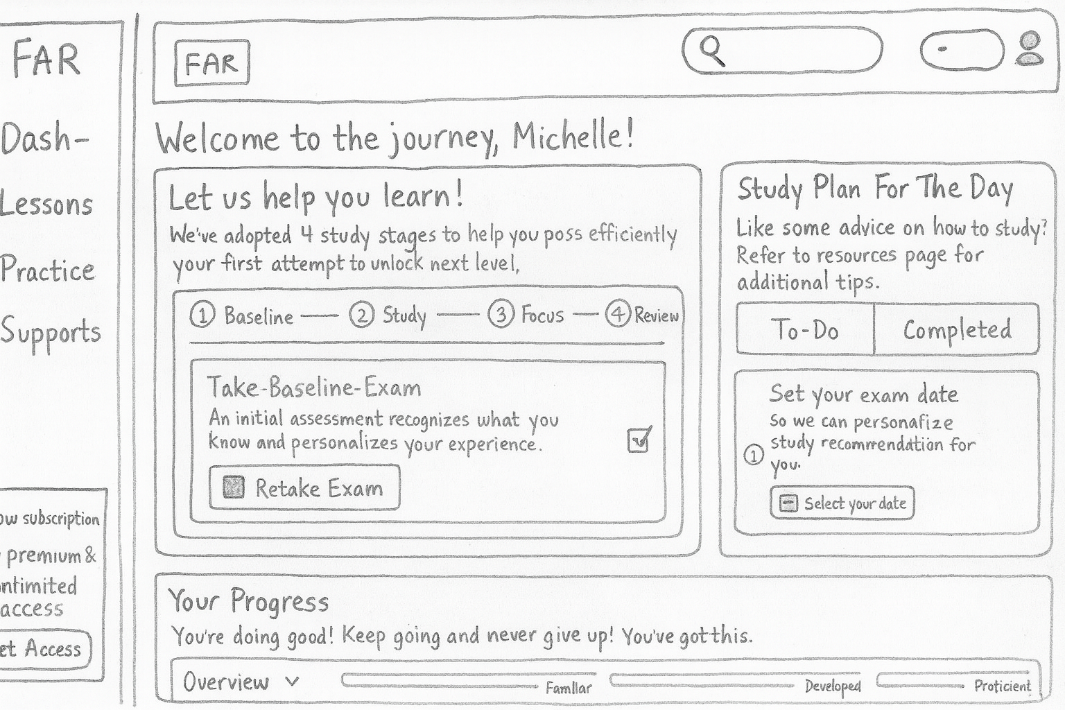
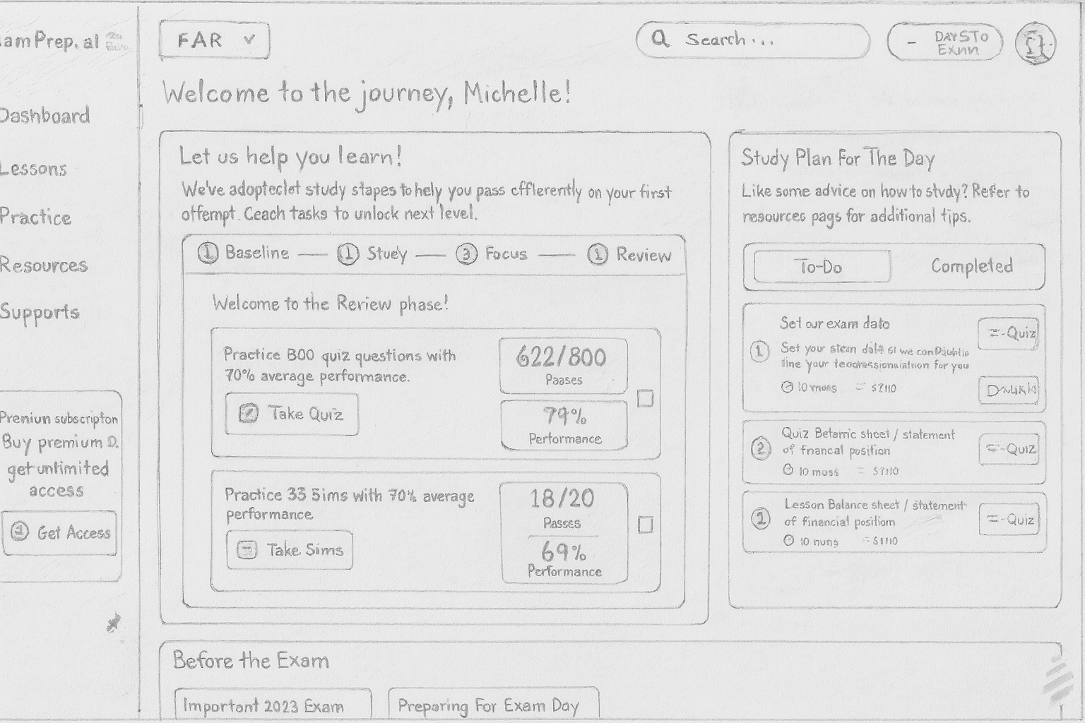
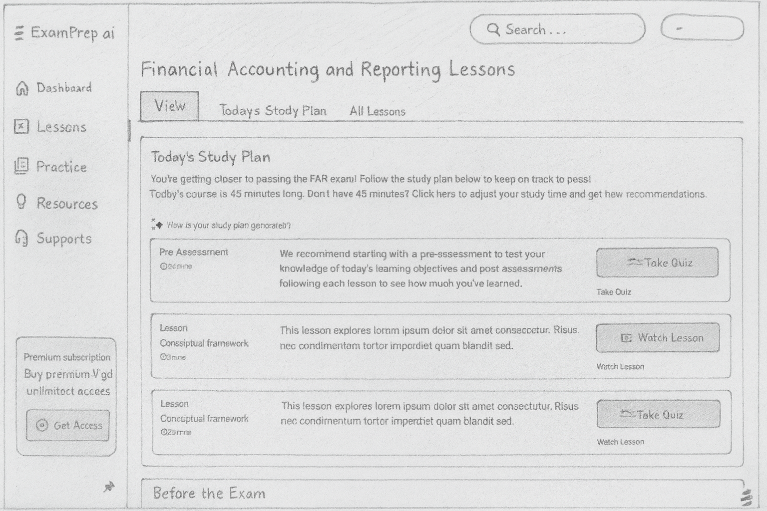
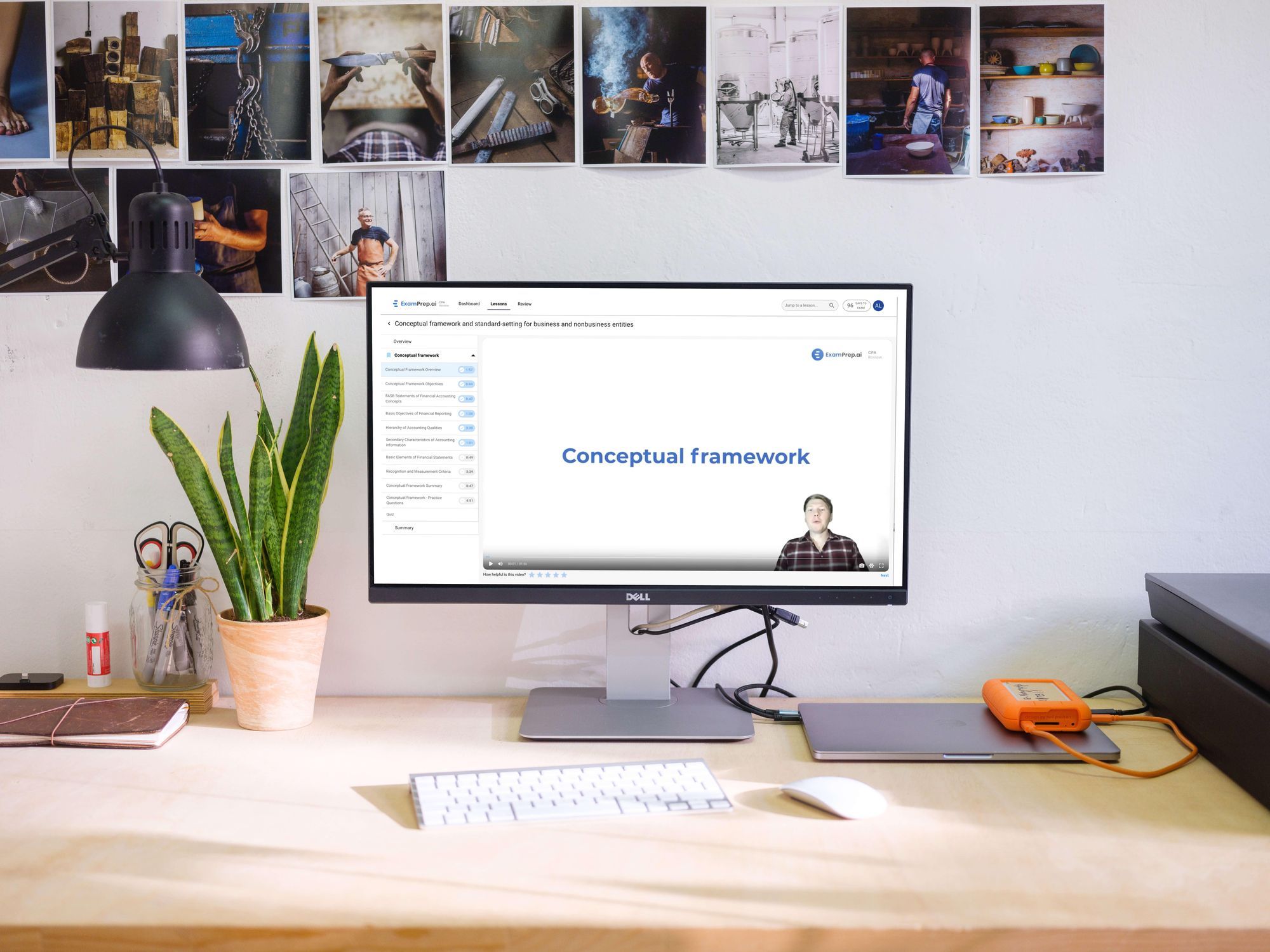
CPA students were getting lost in a cluttered, confusing study platform. They couldn't track their progress, practice and review were disconnected, and the experience fell apart on mobile. I led a full redesign from user research through shipped product, simplifying navigation, unifying the study flow, and making the platform work for how students actually study.
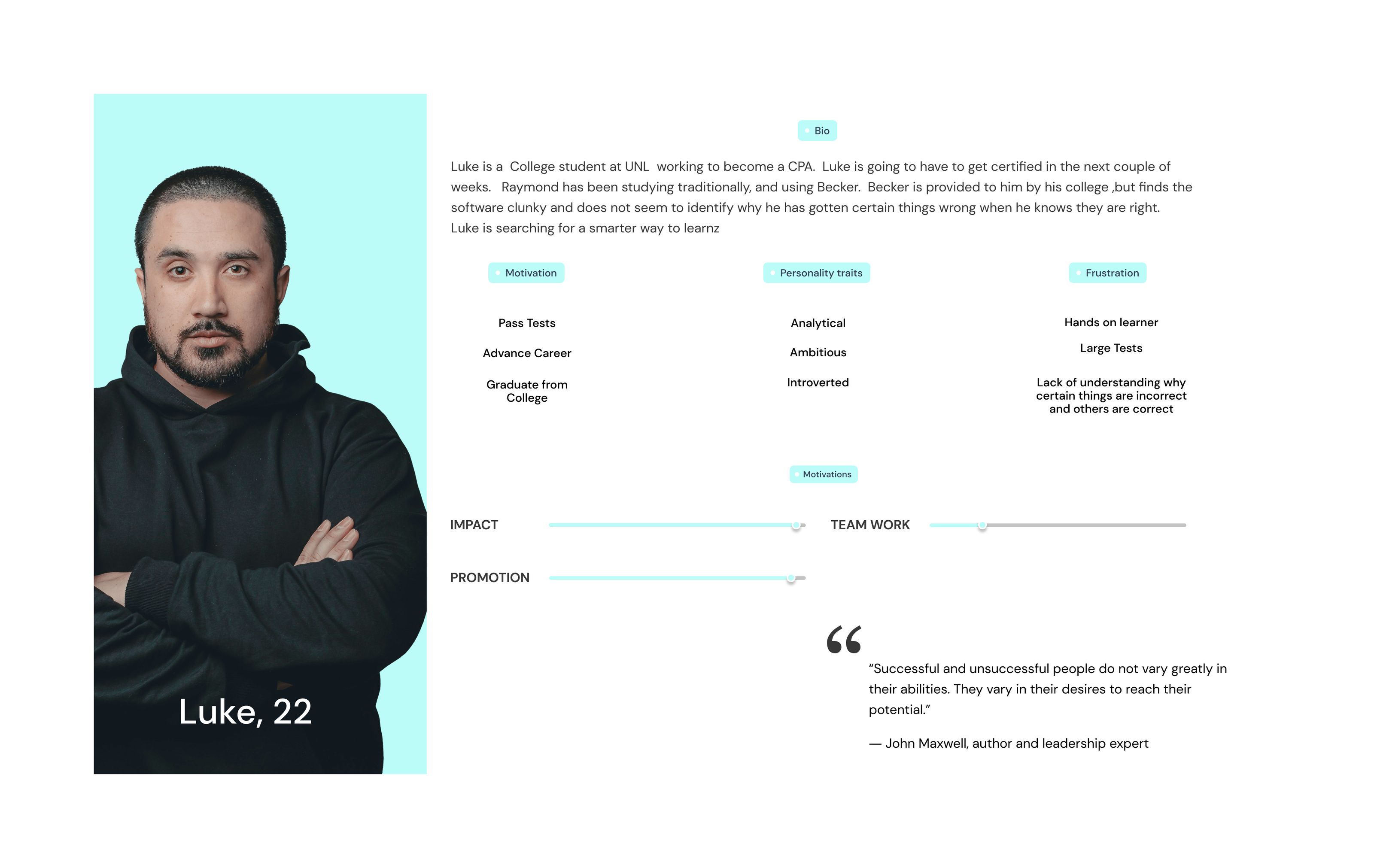
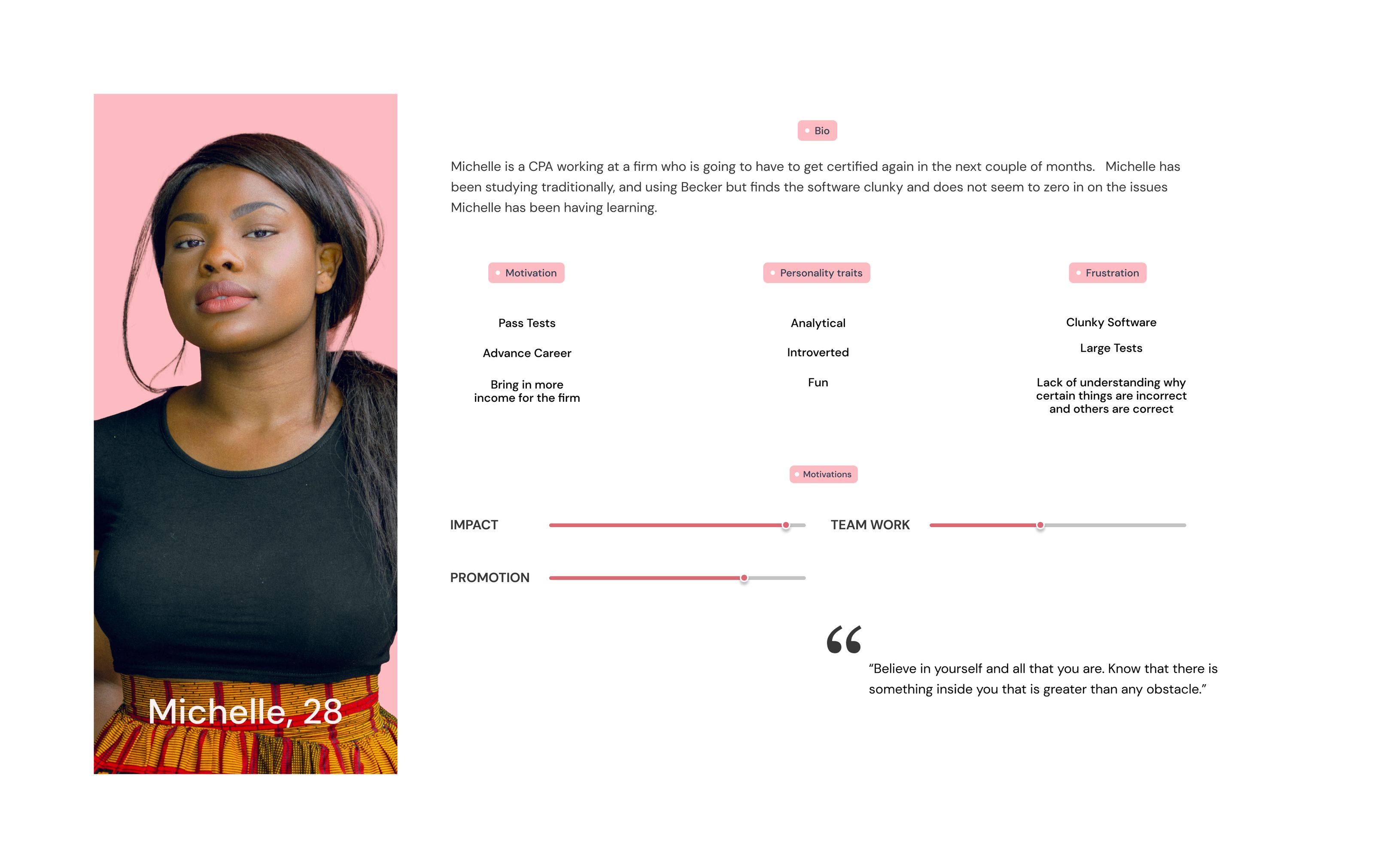
Identifying the specific interaction requirements and logic-states needed for diverse learner profiles.

Allyson Gill
"I had the opportunity to work with during a UX/UI consultancy with Examprep.ai. He was extremely flexible, given our team's time difference and worked well in an agile environment, receiving feedback and acting quickly to create beautiful designs that spoke to our clients needs. James' background in art gives him a strong eye for creating UI designs that are high-quality and visually appealing. His creativity and collaborative spirit make him a great addition to any team!"
Michael Anuzis
"James is an exceptional UX designer who not only possesses a strong theoretical background but also demonstrates outstanding creativity in his work. His leadership on a complex redesign of ExamPrep.ai's practice and review experiences was truly remarkable. He consolidated multiple redundant pages into a single elegant experience that directly addressed user pain points. James' creativity was evident in his ability to come up with innovative solutions to complex design challenges and to use user feedback to create unique and effective designs.James' contributions to our project were invaluable, and any team looking to bring their UX to the next level would be fortunate to have his talents."
Minru Sherry Wu
"I had the pleasure of working with James on a project for examprep.ai, where he designed some outstanding AI icons that captured the essence of our project perfectly. James has a great eye for design and demonstrated exceptional skills in UX design. He is also a great team player who is passionate about his work and always open to feedback. I look forward to the opportunity to work with him again in the future."
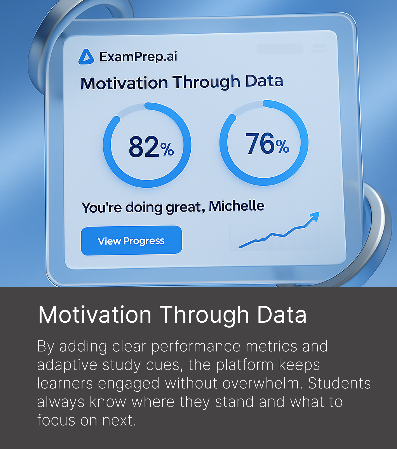
The redesign increased user retention by 35% and reduced navigation redundancy by 40%. Students could finally track their progress clearly, move between practice and review without friction, and study effectively on any device. The platform shipped with a scalable design system ready for future feature growth.